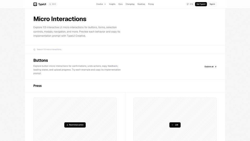
Show HN: UI micro interactions prompts for AI(typeui.sh)
68 points by elwingo1 | 43 comments
TypeUI gallery of 113 interactive UI micro interactions (buttons, inputs, modals, sliders, etc.) with copyable implementation prompts for AI coding tools.
46 stories tagged ui-design, newest first.
68 points by elwingo1 | 43 comments
TypeUI gallery of 113 interactive UI micro interactions (buttons, inputs, modals, sliders, etc.) with copyable implementation prompts for AI coding tools.
55 points by surprisetalk | 19 comments
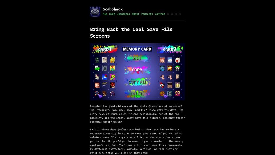
A blog post reminiscing about the memory card save file screens of sixth-generation consoles like the Dreamcast, GameCube, PS2, and original Xbox.
187 points by firloop | 24 comments
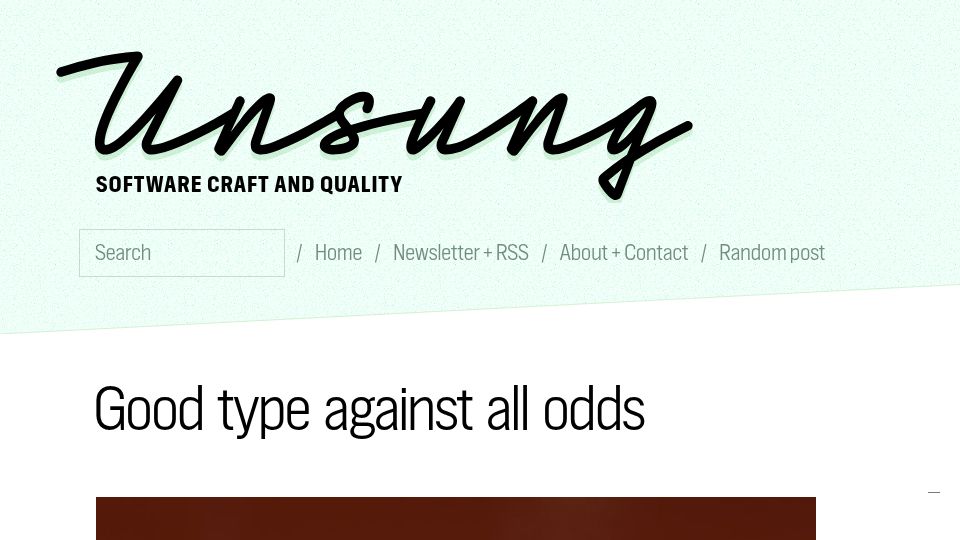
A blog post on Unsung, a software craft and quality blog, titled "Good type against all odds" about typography done well under constraints.
449 points by riffraff | 275 comments
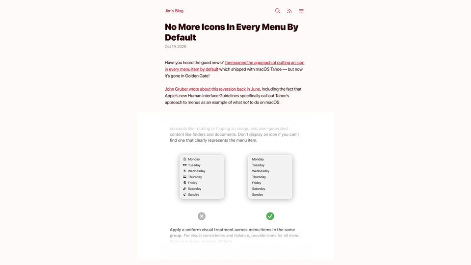
Blog post by Jim Nielsen noting Apple removed default icons from every menu item in macOS Golden Gate and updated its Human Interface Guidelines against the practice.
44 points by cat-whisperer | 36 comments
An essay by design engineer Emil Kowalski arguing that taste and attention to detail differentiate software products now that functionality is commoditized.
7 points by mmilanovic4 | 0 comments
Blog post explaining Fitts's law and why placing the menu bar at the screen's top edge makes it faster to target.
39 points by timpera | 28 comments
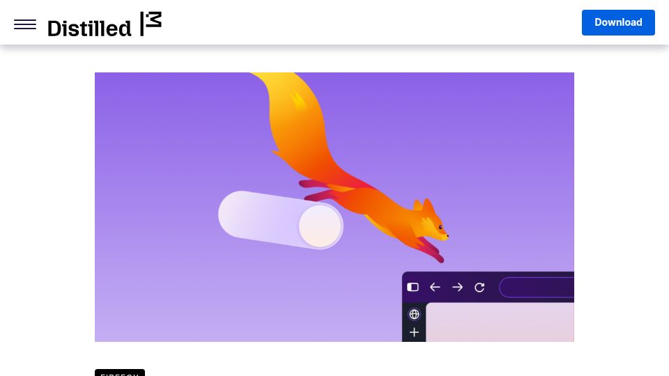
Mozilla Distilled blog post announcing the redesigned Firefox browser interface.
251 points by theanonymousone | 177 comments
A blog post listing ten telltale signs of a low-quality, AI-generated-looking "slop" user interface, such as excessive gradients, rainbow colors, and pulsing badges.
66 points by 2Ucoder | 39 comments
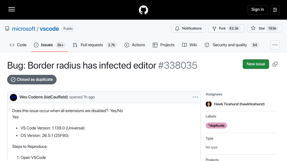
A GitHub issue on the microsoft/vscode repository reporting that border radius styling has spread across the editor UI in version 1.139.0, closed as duplicate.
363 points by signa11 | 449 comments
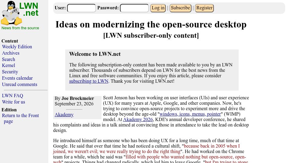
LWN.net article reporting on Scott Jenson's Akademy 2026 talk urging open-source projects like KDE to move desktop design beyond the traditional WIMP model.
665 points by gavide | 418 comments
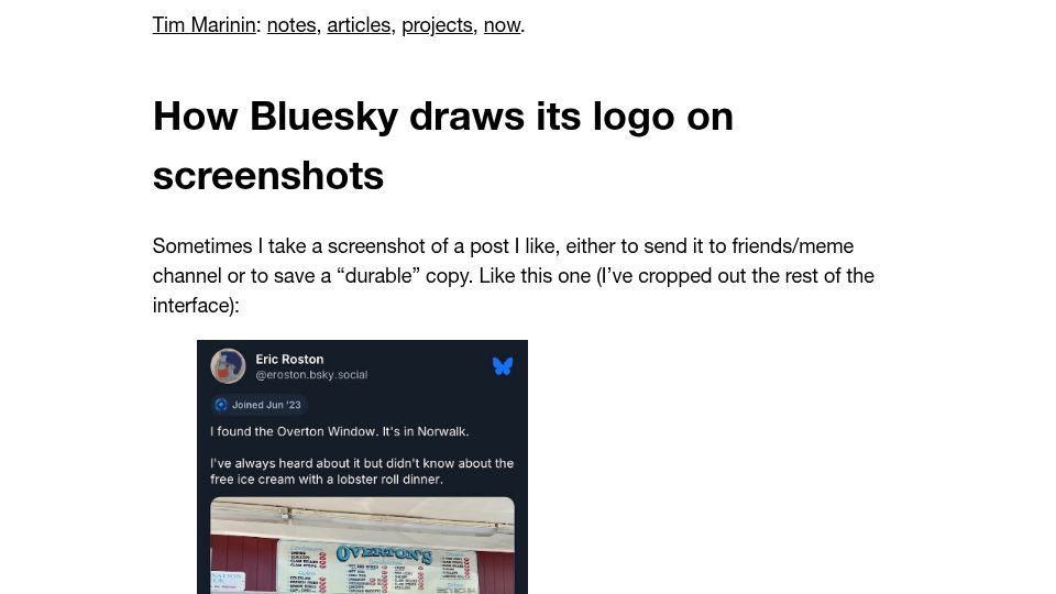
Blog post by Tim Marinin examining how the Bluesky app adds its butterfly logo to screenshots of posts.
343 points by montroser | 157 comments
Blog post by Jim Nielsen on emerging design idioms of the AI era, like the sparkle emoji and rainbow colors, compared to the hamburger menu.
648 points by Gecko4072 | 157 comments
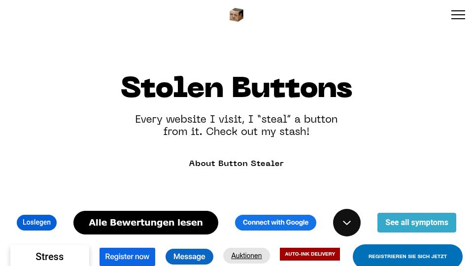
A gallery of website buttons collected by Anatoly Zenkov's Button Stealer extension, which grabs a button from every site he visits.
505 points by nozzlegear | 249 comments
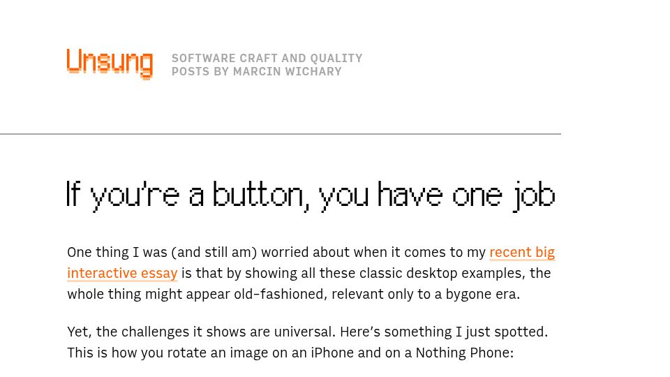
A blog post by Marcin Wichary on the Unsung blog comparing image-rotation buttons on iPhone and Nothing Phone to illustrate universal UI button design challenges.
650 points by zdw | 240 comments
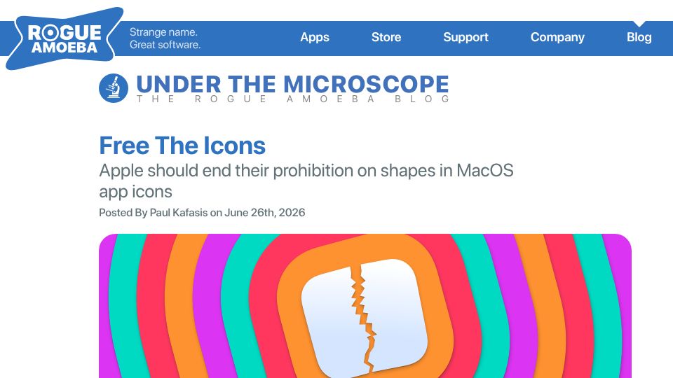
Rogue Amoeba blog post by Paul Kafasis arguing Apple should end its prohibition on custom shapes in macOS app icons.
792 points by ravenical | 260 comments
Blog post by Nikita Prokopov (tonsky) arguing that UIs should follow Wayland's "every frame is perfect" goal, avoiding glitchy intermediate states.

1098 points by lizhang | 196 comments
Landing page for performative-ui, a satirical MIT-licensed React component library of AI startup design tropes like gradient text, sparkles, and prompt heroes.
351 points by OuterVale | 232 comments
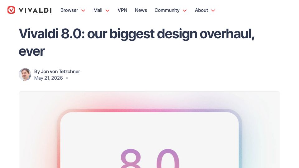
Vivaldi blog post by Jon von Tetzchner announcing Vivaldi 8.0 for desktop, described as the browser's biggest design overhaul ever.
668 points by phil294 | 362 comments
John Loeber's 2023 Substack essay arguing for a return to idiomatic, consistent UI design like that of the desktop software era.
509 points by speckx | 340 comments
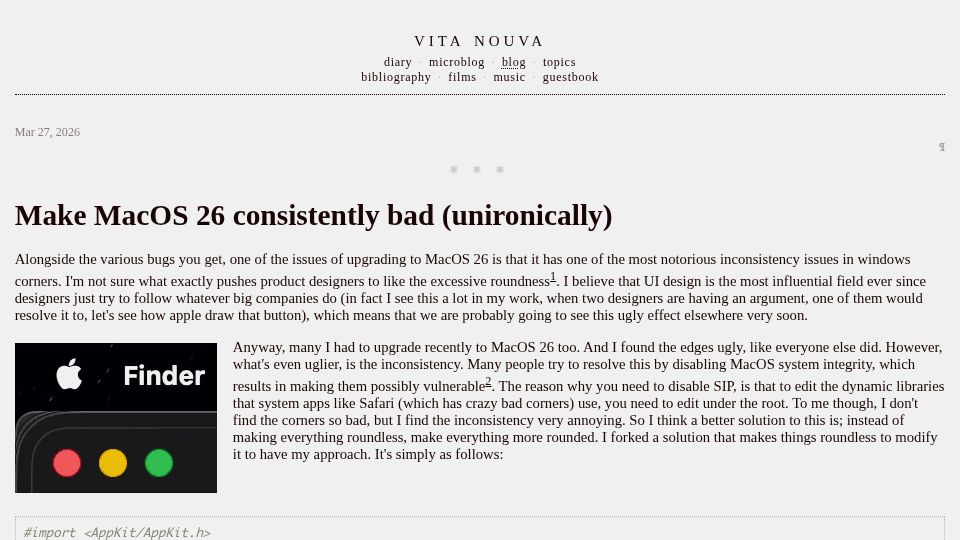
Blog post on making macOS 26 window corners consistently rounded across apps via an AppKit code tweak, instead of disabling SIP to remove roundness.
581 points by ksec | 479 comments
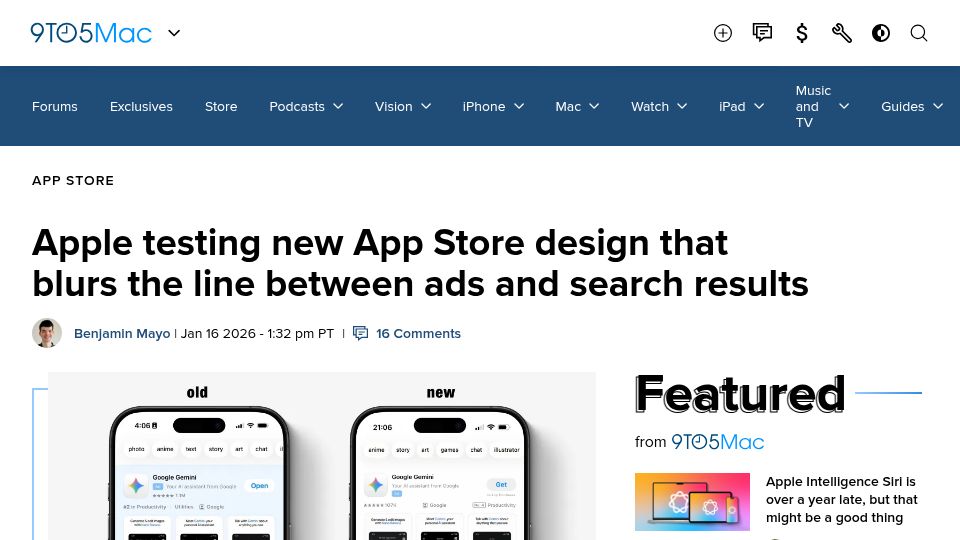
9to5Mac article reporting Apple is testing an App Store search design that makes sponsored ads look more like regular search results.
2688 points by happosai | 1158 comments
Blog post arguing that macOS Tahoe's large window corner radius makes resizing windows by dragging their corners harder, hurting usability.
2231 points by lylejantzi3rd | 873 comments
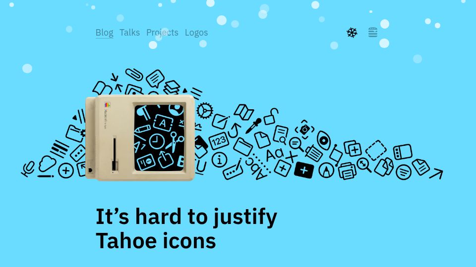
Nikita Tonsky's blog post critiquing the menu icons added throughout macOS Tahoe and arguing they are hard to justify from a UI design perspective.
769 points by ArmageddonIt | 307 comments
Jim Nielsen's blog post criticizing the UI trend of putting an icon on every menu item, using Google Sheets menus as an example.

724 points by selvan | 176 comments
GitHub repository for Penpot, an open-source design and prototyping tool for design and code collaboration, positioned as an alternative to Figma.
798 points by jaydenmilne | 522 comments
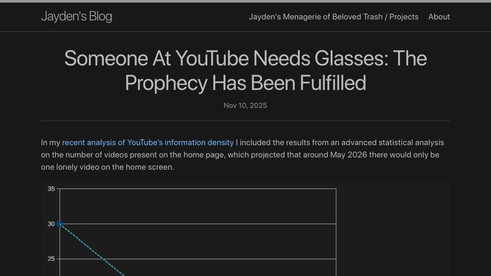
Blog follow-up claiming a joke prediction that YouTube's home page would shrink to showing very few videos has come true, with a chart of declining video counts.
866 points by cryptophreak | 559 comments
A blog post arguing that free and open-source software often has interfaces too complex and intimidating for non-technical users.
618 points by Bogdanp | 418 comments
John Ozbay's blog post arguing that Apple's attention to detail in its products and software has declined over the last 8-10 years.
529 points by uxjw | 373 comments
Nielsen Norman Group article by Raluca Budiu critiquing iOS 26's Liquid Glass visual design for obscuring content and harming usability.
345 points by Bogdanp | 141 comments
Daring Fireball post by John Gruber critiquing the redesigned utility app icons in macOS 26 Tahoe as a warning sign for Apple's design direction.
538 points by cxr | 382 comments
ACM Interactions feature by Philip Kortum arguing that hidden interface controls harm usability, drawing on Engelbart and Norman's knowledge-in-the-world concept.
383 points by kris-kay | 99 comments
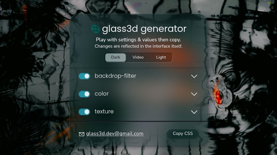
glass3d is an interactive CSS generator for a layered glassmorphism effect with adjustable backdrop-filter, color, texture, and bevel, outputting copyable CSS.
659 points by meetpateltech | 1049 comments
Apple Newsroom press release from June 9, 2025 announcing a new universal software design language across its platforms.
332 points by meetpateltech | 516 comments
Google Design library article introducing Material 3 Expressive, an update to Material Design informed by Google's user research.
403 points by troupo | 314 comments
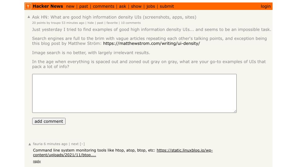
Ask HN thread requesting examples of user interfaces, apps, and sites with high information density, with replies like htop-style terminal tools.
1293 points by jaydenmilne | 650 comments
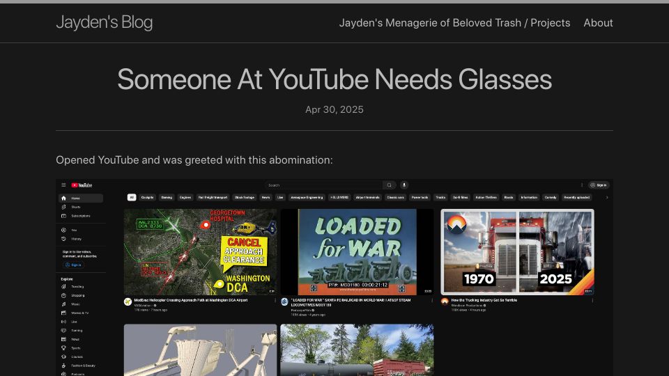
A personal blog post complaining about YouTube's redesigned homepage layout, which shows only a few oversized video thumbnails per row.
378 points by matser | 150 comments
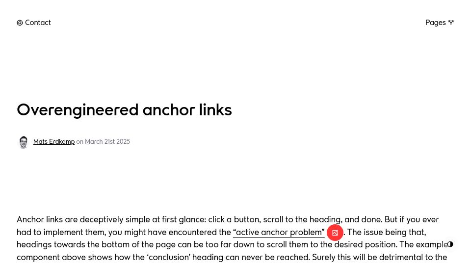
Blog post by Mats Erdkamp exploring the 'active anchor problem' in anchor link navigation and an overengineered solution for headings near the page bottom.

576 points by hello12343214 | 183 comments
A demo page for Scroll Buddy, an animated stick figure that walks up and down the side of a web page in place of a standard scrollbar.
712 points by tyleo | 177 comments
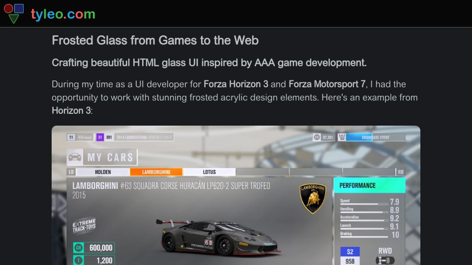
A blog post by a former Forza UI developer explaining how to recreate the frosted acrylic glass UI effect from AAA games in HTML and CSS.
338 points by niklauslee | 124 comments
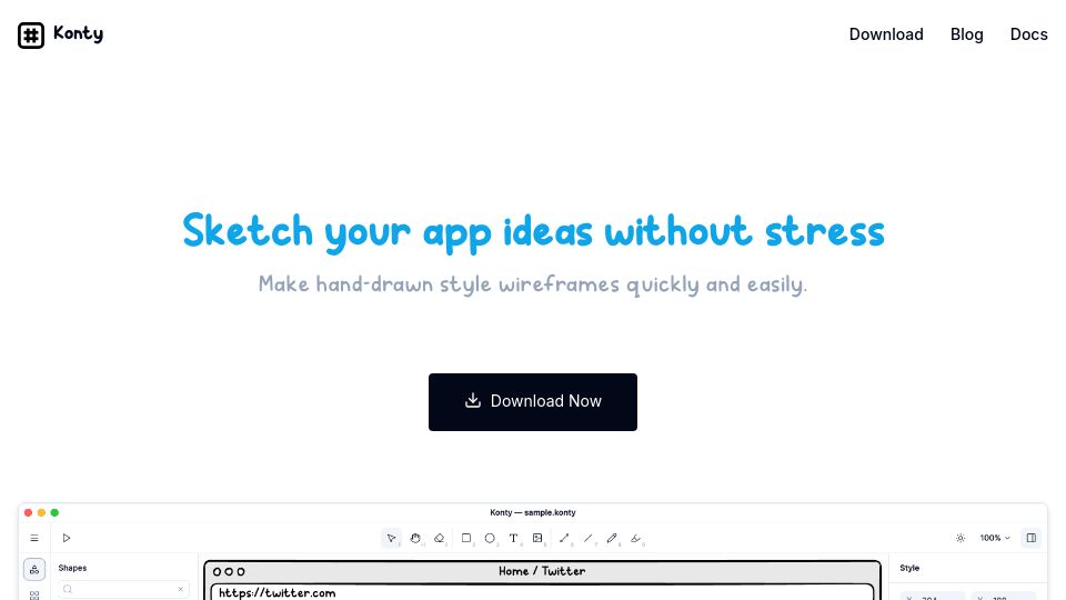
Landing page for Konty, a desktop app for quickly making hand-drawn style lo-fi wireframes of app ideas, positioned as a Balsamiq alternative.
652 points by Mackser | 371 comments
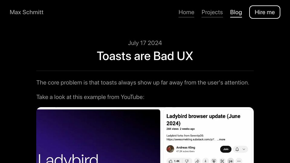
Blog post by Max Schmitt arguing that toast notifications are bad UX because they appear far from where the user's attention is, using YouTube as an example.
695 points by delaugust | 351 comments
Matthew Ström's essay on what UI density means, why interfaces have become less dense, and how designers can design for density.
360 points by wscourge | 268 comments
A User Experience Stack Exchange question asking whether a toggle button should display its current state or the state it will switch to.
414 points by wscourge | 271 comments
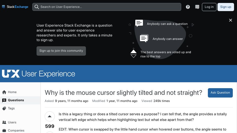
A User Experience Stack Exchange question asking why the mouse pointer cursor is tilted rather than straight, and whether it is a legacy design choice.
1732 points by kevingadd | 461 comments
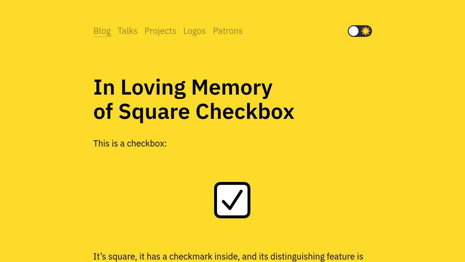
Nikita Prokopov's (tonsky) blog post lamenting the loss of the traditional square checkbox design in modern user interfaces.
553 points by felixbraun | 210 comments
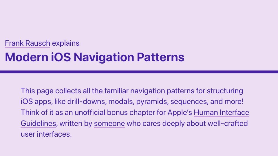
Frank Rausch's guide collecting common iOS app navigation patterns like drill-downs, modals, pyramids, and sequences, framed as a bonus chapter to Apple's HIG.